> For the complete documentation index, see [llms.txt](https://help.smartico.ai/welcome/llms.txt). Markdown versions of documentation pages are available by appending `.md` to page URLs; this page is available as [Markdown](https://help.smartico.ai/welcome/products/mini-games/custom-skins-for-mini-games/missions-lootbox-skin.md).
# Missions Lootbox Skin
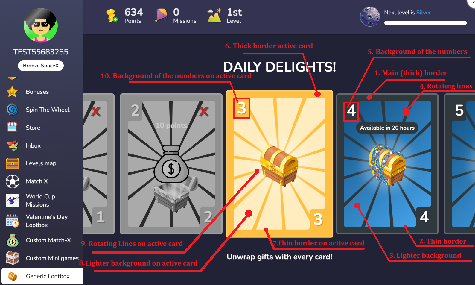
With the Generic skin in the Mission Lootbox, you have the flexibility to add your own images directly from the BO. Additionally, you can customize the colors of the cards. Below is a list of the customizable images:
* Custom section background image for desktop
* Custom section background image for mobile
* Image for closed box
* Image for locked box
* Image for opened box
### Back-Office Setup
To configure the Generic skin:
1. Go to **Gamification → Custom Sections**.
2. Create or edit a section with **Section type** set to **Missions Lootbox**.
3. Under **Section setup**, select **Generic** in the **Theme** dropdown.
4. Upload your image package `.zip` file into the **Skin images** field.
5. Add any custom style rules into the **Custom CSS** editor.
6. Link your scheduled daily missions under the **Missions** tab.
### Image Package Specifications & Required File Names
When preparing custom skin images for upload, all files must be in PNG format and saved with the following exact file names:
* `desktop-bg.png` — Background image for desktop screens.
* `mobile-bg.png` — Background image for mobile screens.
* `closed-mission-icon.png` — Box icon displayed on available cards before they are opened.
* `locked-mission-icon.png` — Box icon displayed on upcoming locked cards.
* `opened-mission-icon.png` — Box icon displayed behind the reward graphic once a card is opened.
Place the files directly in the root of a `.zip` archive without subfolders. If any image file is missing or fails to load, the widget automatically falls back to the default generic skin asset.
Below you can find a reference package with the images:
{% file src="/files/I8Rhe8CakU4Xt6mc57Jr" %}
You can further customize certain elements by applying your own CSS. Below are some helpful styles to get you started:
```css
/* 1. The color of the cards' main (thick) border */
.generic-layout .cards-container .mission-card {
background-color: #101010;
}
/* 2. The color of the cards' thin border that fills the space between the corner and
the main border */
.generic-layout .cards-container .mission-card .gap-filler {
border: 4px solid #101010;
}
/* 3. The color of the lighter background behind the rotating lines of the cards */
.generic-layout .cards-container .mission-card .mission-card-inner {
background: #352B12;
}
/* 4. The color of the rotating lines of the cards */
.generic-layout .cards-container .mission-card .mission-card-inner .generic-rotating-bg {
background: #101010;
}
/* 5. The color of the background of the numbers in the corners of the cards */
.generic-layout .cards-container .mission-card .mission-card-inner .mission-card-corner {
background: #101010;
}
/* 6. The color of the ACTIVE card main (thick) border */
.generic-layout .cards-container .mission-card.active {
background-color: #AB8219;
}
/* 7. The color of the ACTIVE card thin border that fills the space between the corner and
the main border */
.generic-layout .cards-container .mission-card.active .gap-filler {
border: 4px solid #AB8219;
}
/* 8. The color of the lighter background behind the rotating lines of the ACTIVE card */
.generic-layout .cards-container .mission-card.active .mission-card-inner {
background: #B8963E;
}
/* 9. The color of the rotating lines of the ACTIVE card */
.generic-layout .cards-container .mission-card .mission-card-inner .generic-rotating-bg.active {
background: #AB8219;
}
/* 10. The color of the background of the numbers in the corners of the ACTIVE card */
.generic-layout .cards-container .mission-card.active .mission-card-inner .mission-card-corner {
background: #AB8219;
}
/* 11. The color of the CTA button */
.generic-layout .cards-container .mission-card .mission-card-inner .card-center .cta-lootbox {
background-color: #001F43 !important;
color: white !important;
}
/* 12. The color of the Title text */
.generic-layout .generic-layout-title {color: white !important;
}
/*13. The color of the Reward text */
.generic-layout .cards-container .mission-card .mission-card-inner .card-center .card-reward {color: white !important;
}
/*14. The color of the description text on the bottom */
.generic-layout .layout-description {color: white !important;
}
```
### Additional CSS Selectors for Card States and Elements
You can also target specific card states, countdown timers, and reward graphics:
```css
/* 15. Style for missed cards (unopened cards from past days) */
.generic-layout .cards-container .mission-card.missed {
background-color: #2a2a2a;
border-color: #444444;
}
/* 16. Style for completed cards in the current period */
.generic-layout .cards-container .mission-card.completed {
background-color: #1a3a1a;
}
/* 17. Style for the countdown timer badge above upcoming cards */
.generic-layout .cards-container .mission-card .mission-card-inner .card-center .available-in {
background: #001F43;
color: #ffffff;
border: 1px solid #AB8219;
}
/* 18. Card number in corners */
.generic-layout .cards-container .mission-card .mission-card-inner .mission-card-corner .card-number {
color: #ffffff;
}
/* 19. Reward image sizing inside opened cards */
.generic-layout .cards-container .mission-card .mission-card-inner .card-center .card-image {
width: 90px;
height: 90px;
}
```
Read more about the Missions Lootbox in:
{% embed url="" %}
### Frequently Asked Questions
**Q: Can I customize the completed (checkmark) and missed (X) corner status icons?**
A: No. The completed checkmark and missed icons in the top-right corner of the cards are built-in platform assets and are not replaced by the skin ZIP package. However, you can adjust the corner backgrounds and card borders using Custom CSS.
**Q: What happens if an image is missing from the uploaded ZIP file?**
A: If any of the 5 required image files (`desktop-bg.png`, `mobile-bg.png`, `closed-mission-icon.png`, `locked-mission-icon.png`, `opened-mission-icon.png`) is missing from the ZIP archive or fails to load, the widget automatically falls back to the default generic skin image for that asset.
**Q: Why is the CTA button not appearing on the opened card?**
A: The CTA button (`.cta-lootbox`) only renders on opened cards when both the **CTA Button Text** and **CTA Button Action** (deep link or URL) are configured within the linked mission settings in the Back-Office.
**Q: Where do the reward icons on the opened cards come from?**
A: The reward image displayed in the center of an opened card is taken from the individual mission's configured image, not from the skin ZIP package.
---
# Agent Instructions
This documentation is published with GitBook. GitBook is the documentation platform designed so that both humans and AI agents can read, navigate, and reason over technical content effectively. Learn more at gitbook.com.
## Querying This Documentation
If you need additional information that is not directly available in this page, you can query the documentation by asking a question.
Perform an HTTP GET request on the following URL with the `ask` and `goal` query parameters:
```
GET https://help.smartico.ai/welcome/products/mini-games/custom-skins-for-mini-games/missions-lootbox-skin.md?ask=&goal=
```
`ask` is the immediate question: it should be specific, self-contained, and written in natural language.
`goal` is what the user is ultimately trying to achieve, the reason they need the answer. Sharing it helps GitBook give you a better, more relevant answer. A goal is most helpful when it describes the outcome the user wants rather than restating the question. For example, with `ask=how do I create an API token`, a goal like `automate deployments from our CI pipeline` lets GitBook tailor the answer to that use case.
The response will contain a direct answer to the question and relevant excerpts and sources from the documentation.
Use this mechanism when the answer is not explicitly present in the current page, you need clarification or additional context, or you want to retrieve related documentation sections.